
What is our market position? Who are our competitors? These and other questions are important with regard to your market development and are crucial for success. The better you know the market and your situation, the more certain you will be about the measures you can take to be successful. Market analysis is information research – and various data provides the basis for this. But what information should you pick out from it all? What is really relevant and what just wastes your time?
We show you how to proceed using a concrete example in our market analysis system MIS:
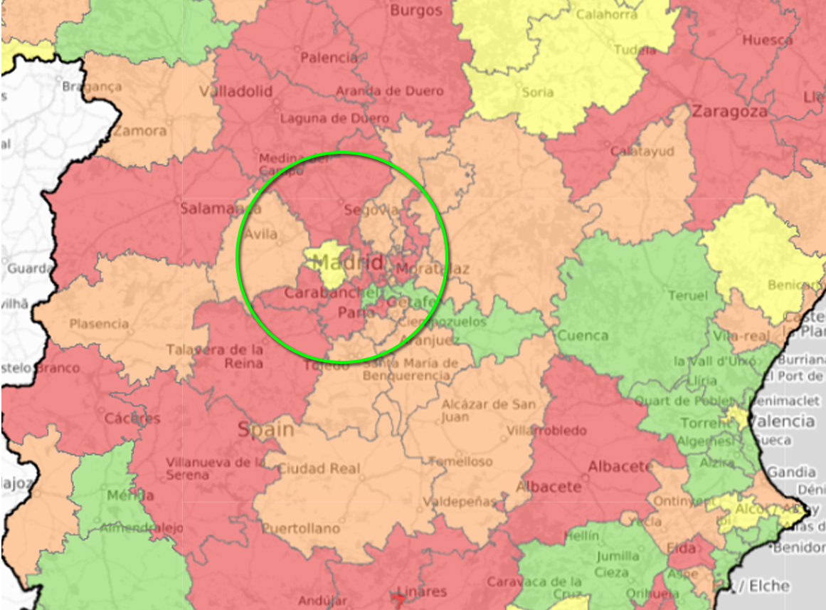
2. Take a closer look – What's going on in the area?
An overview with registration figures for all brands in the selected area breaks down the competitive situation in more detail and makes it possible to identify special features (e.g. influence of fleet customers). This allows you to capture a detailed situation of the market and prepare for talks with dealers.
In the first column of our example, two areas ‒ Robledo de Chavela and Colmenar del Arroyo ‒ have a strikingly high volume compared to the rest of the municipalities. If you look at the brands in the second step, some stand out additionally due to high unit numbers. This is an indication of market distortions, e.g. through commercial registrations.
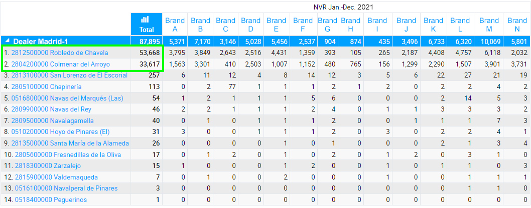
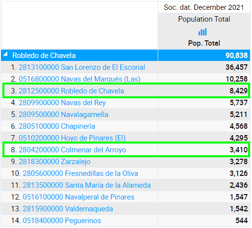
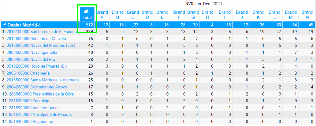
Without commercial registrations, the total registrations in the area of influence of the dealer ‘Madrid’ shrink drastically. So whether commercial registrations are part of your business or not, it makes sense to narrow down the market accordingly. This is the only way to get meaningful figures.
Now we have gained a first, realistic overview of the competitive situation in our selected area. For further details, it makes sense to take a closer look at the competitive situation at the model level.
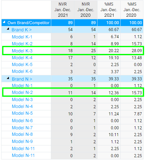
We take a closer look at two comparable models: our own model N-2 and the competitor's model K-3. With a coverage map, we want to find out which model has more registrations in individual parts of the area of influence. In our example, we have additionally shown the dealer locations and the drive-time. Green border markers represent a drive-time of 15 minutes, yellow 30 minutes, red 45 minutes and brown 60 minutes. Is our own location easily accessible for all potential customers?
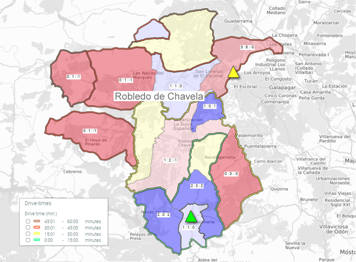
In fact, the map shows us that we have satisfactory coverage around the brand's own location (green triangle). The figures in the sub-areas first show the brand's own registrations, then those of the competitors and the difference between the two on the right.
However, we also see that the number of the brand's own registrations is decreasing in the more northern areas with drive-times over 15 minutes. In line with this, the performance of the competitor (yellow triangle) increases the closer it is to its location. In most parts of the area of influence, it even achieves higher numbers of registrations. This is an indication that the competitor can perform better here because of its proximity to the customer.
The analysis has shown that although the right models are sold here, performance weakens from a drive-time of more than 15 minutes to the dealer location. Targeted marketing campaigns in the more remote areas could help.
Conclusion
The general rule is: Keep an eye on the market! Regularly look at the current figures and question any anomalies. Make the effort once to define the KPIs that are important and relevant to you. Depending on the situation, this can be new registrations, dealer sales or other information. For this, we recommend a fixed, monthly routine with which you can analyse and regularly check the figures for the respective areas. Discuss specific facts and questions with your sales representatives and dealers at eye level. This way you can set goals that form a good basis for everyone.
With a reporting system like our MIS, this is easy to implement. Combine the facts from the system with your local know-how ‒ that's how good information becomes great insights!
Would you like to take a closer look?
We would be happy to give you a live tour of MIS with the KPIs relevant to you. Contact us!
Want to know more about market analyses?
Read more about analysing dealer sales in our Insight ‘Why an in-depth analysis of dealer sales is important’.